Image by linoleum jet via FlickrI am done reading this book, and while I can say that it is almost in the same line of methodologies as the other book from Riders (Bulletproof Ajax), they have different offerings.
Scriptin' focuses on reuseable javascripts, and the final two chapters is supposed to be a working example that brings in all the discussed knowledge.
Unfrotunately for me that can't materialize. It was dealing with PHP, and I don't have a server that runs PHP.
Anyway, the javascripts I have learned just fine, expecially those nice formatting techniques, stripes, character counting, etc., etc.
And of course, these functionalities, more or less, are somewhat available in the Visual Web Developer toolkit.
So what's good about this book?
I know from the ground up how these already-available controls work. If I have to code by hand, I may struggle, but I can survive. I can continue. I won't be stuck.
I can go on Scriptin'!
18 April, 2011
12 April, 2011
Fonts to Use, in Web and in Print
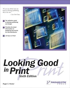
Cover of Looking Good in PrintI've been reading the books by Charles Wyke-Smith, and once again, I have come across the idea of what font is suited best for which application.
I read it long time ago in 'Looking Good In Print' - a book that tells how to style and arrange a page, and what fonts to use, on the title, the text, the headers and footers - everything you need to know and do when it comes to printed materials, and the one thing that I can remember well from that book is when it said that the font best suited for printed matters is serif fonts.
I could have easily made the mistake of saying that that idea was confirmed in one of Wyke-Smith's books, but fortunately, I checked back again.
The book that I have just finished reading, which confirmed that idea is the book by w3schools.com: "Learn HTML and CSS with w3schools" and "Learn CSS with w3schools".
To recap, here's what it said:
For the Web, use sans serif, font size about 12.
For Print, use serif fonts, using smaller font size of about 10.
And this is done by using the '@media' style selector.
Till then!
Related articles
- Grotesk (globalexclaimer.wordpress.com)
- The Sans Serif Typeface (blogs.sitepoint.com)
- How can I get better at using @Font Face (ask.metafilter.com)
- Serif Fonts Vs. Sans Serif Fonts: A Working Case Study (blogs.sitepoint.com)
- Ten Lovely AND Free Sans Serif Fonts For Your Design Work (blogs.sitepoint.com)
- The Old Style Typeface (blogs.sitepoint.com)
- UberSocial Direct Messages Publicly Visible (webpronews.com)
- 10 Tips for Mixing and Matching Fonts and Still Looking Great (go2creativeguy.wordpress.com)
- James Franco Twitter Account Is No More (webpronews.com)
- Steve Wozniak Return to Apple Possible? (webpronews.com)
Labels:
Arial,
Cascading Style Sheets,
Font,
HTML,
Point (typography),
Sanserif,
Serif,
World Wide Web
Subscribe to:
Posts (Atom)