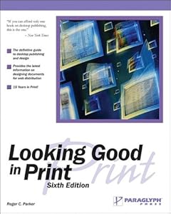
 Cover of Looking Good in PrintI've been reading the books by Charles Wyke-Smith, and once again, I have come across the idea of what font is suited best for which application.
I read it long time ago in 'Looking Good In Print' - a book that tells how to style and arrange a page, and what fonts to use, on the title, the text, the headers and footers - everything you need to know and do when it comes to printed materials, and the one thing that I can remember well from that book is when it said that the font best suited for printed matters is serif fonts.
I could have easily made the mistake of saying that that idea was confirmed in one of Wyke-Smith's books, but fortunately, I checked back again.
The book that I have just finished reading, which confirmed that idea is the book by w3schools.com: "Learn HTML and CSS with w3schools" and "Learn CSS with w3schools".
To recap, here's what it said:
For the Web, use sans serif, font size about 12.
For Print, use serif fonts, using smaller font size of about 10.
And this is done by using the '@media' style selector.
Till then!


No comments:
Post a Comment