Showing posts with label Font. Show all posts

21 February, 2014

Font Viewer - AMP vs Nexus

English: Screenshot of KDE font viewer taken w...
English: Screenshot of KDE font viewer taken with ksnapshot and cut up with GIMP. (Photo credit: Wikipedia)
21-Feb-2014

2 days ago I posted my short article on the Font Editor software that I used, and which one gave me the speed and quick tweaks that I needed.

This time, it is on the font viewer applications, and I ended with 2, again: AMP and NexusFont Font Viewer.

This one was quick. What I needed is a no-brainer font viewer, and one that can and will read and display the full list of fonts from a specific directory.

Too bad, NexusFont only reads from the Windows Font folder - and there are many font viewer apps that can do this.

It was AMP Font Viewer that gave me that flexibility.

Decades ago, when I was still using Windows 95, that would have been FontLister, which is simply an executable file that you keep anywhere and run, and it would do the same thing of displaying the full list of fonts, installed or uninstalled.

Things have changed, and while I think that FontLister.exe is still in circulation, it is no longer in the discussions, so it doesn't come up anymore.

So AMP Font Viewer will be my choice of being the software that displays the full list of fonts in my Windows 8.1 laptop, installed or uninstalled.

Till then!

Enhanced by Zemanta

19 February, 2014

Font Editor - one that suited my need

FontCreator
FontCreator (Photo credit: TZA)
19-Feb-2014

This will be my first article for 2014, and it will be a short one.

I have been working on m Android programming self-study, and part of that is to adjust the font size, both horizontally and vertically, for each Android device.

I am specifically working on the Samsung Galaxy Note 2 device, and I like 3 fonts, namely: Advent, Hattori Hanzo and Yanone Kaffeesatz. These gave me the squarish look and the neatness that I so desired, specially when the font size gets smaller.

Of course, I did a number of Google searching, and I came up with 3, but ended to testing 2 only: FontCreator and Fontographer.

Fontographer can't open the C:\Windows\Fonts folder, however I tweaked the privileges in the program shortcut, and that is not a problem with FontCreator, so it became easy for me to start working and trying FontCreator.

I found that it gave you full control of the dimensions, kerning, etc., to name a few controls or dimensions usually set, reset, fine-tuned and finalized when creating fonts, but later on, some errors came up - one that I can't do anything anymore, even after troubleshooting and searching the web for corrections and/or related issues and the resolutions.

Nada.

And that is some undefined script tags.

Nothing really came up.

At this juncture, I turned to the other application: Fontographer.

And I think at this time, I began using this program taking the right steps: consulting the manual. Or to honestly say, I went straight to what I wanted to do - adjust the font size.

I found that section in the manual, and while it is for Mac, the instruction is the same, with only the machine-based commands being different.

It was easy to follow, so a few mouse clicks, a number of dialog boxes opened, and I was able to try, try again, and finally to do it correctly.

A few tries after that, and a number of font installation in the Android device, and testing of various apps, I was done!

So while FontCreator gave me control, Fontographer gave me a quick and easy way of doing what I wanted, without even bothering about the numbers.

C'est tout!

Enhanced by Zemanta

09 September, 2011

Changing font in Notepad++

English: Icon for Notepad++
English: Icon for Notepad++ (Photo credit: Wikipedia)
SiteSpinnerI am one user who prefers to "see" the fonts in whatever application I'm using to my preferred font faces. As I was looking for some text editor that could both be better than Notepad, the one that comes with XP/Windows 7, a standard issue, I could say, and with another functionality - to be able to handle html editing.

I found Amaya, which is supposed to be W3's choice, etc., etc., (I mean, there is so much said about Amaya), but I didn't see to like it, and then there are a lot more of those free HTML editors, but what I found to be simple enough to use, and lightweight enough to be installed, and works (last one is the 'ummpphh!' factor), I sticked to Notepad++.

And as said, I wanted to use my own fonts in this software, and I searched, and searched, and searched, and what I knew from other softwares, it doesn't apply to Notepad++.

The Russian Editor

So I searched the bottomless world wide web for ways and means of doing what I wanted to do, and I found some, most of which offers the solution that I have tried - and of course - didn't work (what are those guys thinking?). But I found 2 or 3 that gave the correct solution and approach.

I have lost those links, as I quickly applied, and did some other things that I wasn't able to log those links (for attribution; sorry guys). Here is how it works:

Refactoring HTML: Improving the Design of Existing Web Applications1. Settings > Style Configurator >

  1. Language: Global Styles
  2. Style: Default Style (not Global override)
  3. Then you set your font (right side)


2. Try and make use of the themes:

  1. Select theme: Black broad, Bespin, etc.
  2. Then do again Step #1.


You should be looking at your preferred fonts after this, and the theme of your own liking.

Enjoy!

12 April, 2011

Fonts to Use, in Web and in Print

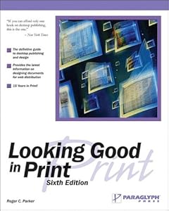
Cover of "Looking Good in Print"Cover of Looking Good in PrintI've been reading the books by Charles Wyke-Smith, and once again, I have come across the idea of what font is suited best for which application.

I read it long time ago in 'Looking Good In Print' - a book that tells how to style and arrange a page, and what fonts to use, on the title, the text, the headers and footers - everything you need to know and do when it comes to printed materials, and the one thing that I can remember well from that book is when it said that the font best suited for printed matters is serif fonts.

I could have easily made the mistake of saying that that idea was confirmed in one of Wyke-Smith's books, but fortunately, I checked back again.

The book that I have just finished reading, which confirmed that idea is the book by w3schools.com: "Learn HTML and CSS with w3schools" and "Learn CSS with w3schools".

To recap, here's what it said:

For the Web, use sans serif, font size about 12.
For Print, use serif fonts, using smaller font size of about 10.

And this is done by using the '@media' style selector.

Till then!

Learn JavaScript and Ajax with w3SchoolsLearn HTML and CSS with w3SchoolsLearn CSS with w3Schools

Enhanced by Zemanta