09 November, 2010

Japanese Food Recipe for iPad

Once again, here is a new app for iPad:
Let's Cook Japanese Food!: Everyday Recipes for Home CookingJapanese Food Recipe

To read the review, follow source article below:
Japanese Food Recipe for iPad - Quick Review
Enhanced by Zemanta

Real-time cancer diagnosis

Patient lift for king size bed in homecare. Th...Image via WikipediaAnd if there is good use of the latest technology, I can say this is one of it.

Read on...
-----

If you've ever had blood work or a tissue biopsy taken, you know how excruciating the long wait for test results can be. Even routine tests for common diseases like strep throat can take several days to process, and cancer diagnoses can take weeks. Besides the anxiety that builds over time, a late diagnosis can mean critical delays in treatment and patient care.

To continue, click here for the full text of the source article.
-----

Enhanced by Zemanta

25 August, 2010

SQL Optimization

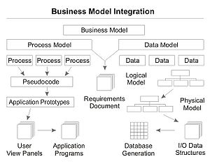
Process and data modelingImage via WikipediaI didn't think about optimizing my SQL scripts until some recent events, where I was called by one of the guys in the IT Infra team told me some bad news: I'm in the top 3 list. And that isn't something to be proud of: it was the list of the scripts that is being monitored as being resource-hogging.

I immediately checked on the said script, and to my surprise, it was a very simple one!

Which means one thing: I never thought about writing SQL scripts that are optimized. for 10 years, I was simply writing scripts, not minding whether or not they are optimized.

But the good side of that is this: help was available.
The guy who flagged me of the problem is also the one who would eventually show me how to do optimization. I said I was one who didn't formally learn SQL scripting, and it was all self-study, trial and error. So the big error happened.

And to my surprise, he has the same story to tell! (Which means I have nowhere to run, but to optimize my queries...)

How did we go through the optimization? Just a few things really did happen, and I can say it worked, because my daily report running at midnight had a drastic runtime reduction - from 2.5hours to less than an hour. And I'm still optimizing the scripts, of course, with the script runtime still reducing from time to time.

And so, below are what we did, 'we' at the start, then 'me' to carry on the work, till today.


5 Simple Steps taken to optimize the scripts:
1. Table Indexing
2. Optimized Views
3. Local Tables
4. Break Where Predicates
5. Rearrange the filters

Table Indexing
My colleague pointed out that before you even write a script (and my thought raced back 10 years ago when I started writing queries, huh?) is to know whether the table holding the data I want is indexed or not. If the table(s) are indexed, go ahead and write your queries against it. if not, try the next one: optimized views

Optimized Views
Many a times an index will not be possible - due to system constraints. An index taxes the RDBMS to a certain degree, and indexing one table that has updates (insert, delete, update) frequently creates more problem than it would solve. The solution? Some top-gun guys who know the trade would just create optimized views, indexed for optimum run, and independent from the main table. Of course, these views would be updated regularly, like hourly, since that is the very reason they are created - to get away from the problem of instantaneous updates that will inhibit the creation of indexes. So don't forget that optimized views, while indexed, are usually updated on an hourly basis.

Local Tables
Sometimes there are no indexed tables, and though there are optimized views, these are enough, or simply, the data you want is not in them. Views cause the problem of additional system load if they are used with additonal criteria. A view is already a query, so additional filtering against a view will pose more system load.
So create your own local table. Create your own local tables to store temporary data. Run simple queries and store the data in your local tables. You'll be surprised how it helps!

Break Where Predicates
Okay, the very use of the local tables is when you take a complex WHERE clause, break it into individual queries, small enough to have one, single WHERE clause, and run it, saving the data in the local table. And don't forget that you should be indexing these local tables for optimum run!

For example, if you have 4 filters in the WHERE clause, break it, store the data in your local tables, and run against each previous local table.

Try out cascaded query style, running queries against the previous data, and see if that doesn't speed up your scripts.

Try using JOIN in the FROM clause instead of putting everything in the WHERE clause.

Rearrange the filters
If the filters in the WHERE clause can't be broken or can't be reduced, try rearranging the filters. Goal is to begin from the top with the filter that will immediately reduce the data size being captured, for the succeeding filters to work against as the script progresses. And it may not be done at first try, so this is a continual process, even many years after. (Hey, that is exactly my experience here).

So there you have it. 5 simple steps to optimizing queries. While these I have applied, and have worked for me, the optimization steps are not limited to these 5 alone. As in software development, the saying is true: "There is nothing permanent but change." Hopefully this helps you, and it helped me - a lot.


Till then!


Enhanced by Zemanta

12 July, 2010

XP Welcome Screen and Fast User Switching

Windows XP ProI was testing a new network connection from my cable modem since it is supposedly free. And I'm not that very familiar with this task, I know a bit of it here and there. I happen to install a network driver, and what happened next is something that I did not want: the login screen was changed, and it was asking now for a password.

I had a problem, since that computer was used primarily by my kids...

I searched the web, and for a time and a season it seems, I did not find what I was looking for - how to restore the XP Welcome Screen and the Fast User Switching function.

All that is being thrown up is either disabling the login screen or restoring it - which is not what I want.

What I was looking for is help on how to remove the now-unwanted login screen that asks for a password, when there isn't, and restore the Welcome Screen and Fast User Switching function.

I stopped searching. Tried the next day, and still failed to get an answer. Some search results seem to be a promise, but the moment you click on the link, you are 'offered' a trial membership, blah-blah-blah. I'd close that page immediately!

Microsoft Windows XP Home Edition FULL VERSION with SP2The third day, I think I got the answer.I tried typing for NetWare and XP login screen, but what it should be is "Welcome Screen and Fast User Switching" search text. That is what gave me the help I needed.

So I was able to fix the problem with the following steps:

1. Go to Settings, if you have it, then Control Panel.
2. Click on Network Connections.
3. Right-click on every network connection that you have, then on Properties.
4. Perform an uninstall for Client Services for Netware.

When this is done, go back to Control Panel.
1. Click on User Accounts.
2. Tick, as per your choice, the two options:
a. Use the Welcome Screen
b. use Fast User Switching
3. Click on Apply Options.

And we're all set!
-----

Enhanced by Zemanta

07 July, 2010

Running javac in Windows

Image representing NetBeans as depicted in Cru...Image via CrunchBase
I just began my self-study in java using Netbeans 6.9 IDE, and I just managed to get through the "Hello World!" code using the IDE, which is followed by running the same small program in the shell.

I typed the compiler as indicated in the directions, but I got an error, like 'javac is not recognized....' or something like that.

I searched the web, which is usually my primary source of assistance, as it is with my self-study matters, and I got the first page with the top results containing the solution to my problem.

It is simply including the javac location in the PATH declaration.

So I did.

I opened up a Windows Explorer, right click on My Computer, and on Properties, then on Advanced tab, then on Environment Variables, then on the top window, which is the user's "User variables".

Open up "PATH" or "path", whichever is the one in your PC, then include the javac directory, for my case, is "C:\Program Files\Java\jdk1.6.0_01\bin> javac". That means going to the end of the current definition, adding a semicolon, then the file location, which is again, "C:\Program Files\Java\jdk1.6.0_01\bin> javac".

Click on OK, then the other OK, and the final thrid OK.

That sets the path for javac. There is no need to restart your PC, as was the case for me. But if javac still isn't recognized, try to do a restart, to be sure.

Till then.

Enhanced by Zemanta

17 May, 2010

Making Money Online

Coins and banknotes, two of the most common ph...Image via Wikipedia
Making Money Online.

While there are hypes about making money online, and there are so many 'gurus' as they would call themselves that, the truth can never be known from simply listening to these guys.

I'm years now into blogging, and I was once enamored by this enticing possibility. Why not? It is free, and all you have to do is blog your heart out. It's what we'd usually call enjoying what you like doing, and earning from it at the same time.

All that easy, right?

Wrong!

when these gurus talk, it is most probably that they are talking about something that is true. They show you their money. They show your their car. They show you their house (mansion, to be more precise). They show you many things that makes you drool, and say to yourself, "I want what this guy has."

Enticement. That is the whole truth of it. They speak only half the truth. That's where the danger lies.

You see, if you are working hard, and at the end of the day, the money you hold in your hand is what you'd call the produce of your hard work, your sweat and blood, your hard-earned money, would you part with it that easily? Would you think twice if you were to put it in some mysteriously high-paying plan, the source of which you wouldn't know, or couldn't even understand?

That's the whole truth of it. Making Money Online is:
1. Hard Work
2. Takes Time
3. Can't be through AdSense alone
4. Can't be through Affiliate Marketing alone
5. All the other hypes that you'd usually hear from 'multi-millionaire gurus'....

You earn when you sell. So basically, Making Money Online is about selling. And you don't sell crap to people, mind you. Don't be like those scammers and fraudsters who make money online by cheating you with your eyes open!

So please, making money online is not something mysterious. You want to earn, sell. And it has to be a legit product. It has to add value to your customers. It has to be a product of value and quality. Not hype. Not scam.

That is Making Money Online.

Agree? Spin a win!


Reblog this post [with Zemanta]

14 May, 2010

The iPhone Manual

If there is one great gadget, many will say that it's the iPhone. Well, I don't own one right now, and I'm not crazy about it. Really!

And while many are enjoying that cute gizmo, many who wanted to try it out are turned off with it, because when you open up the box, all you get is that cute gadget - nothing more.

So where's the manual?

Many years ago, I remember one supplier trying to sell their product to our Facilities team, a software monitoring tool for building management. It was cute and nice, will all the nice icons and buttons and all those functions that I can consider quite advance that time.

Well, the guy did the demo very well, and the Facilities guys were impressed, and as by default, they would usually want to try it out - on their own.

The question was asked, "Where's the manual?"

"Their ain't none," was the answer.

Immediately you would know that these guys were turned off. They turned their back slowly, and one by one they left.

Fast forward to today. I have a colleague who bought the iPhone, and she don't like it. She's used to a Windows Mobile phone, and making the switch to an i-, i-, i- and all others i-'s drives her nuts.

It's worse. There's no manual, and she doesn't know what to do, how to make it work, what buttons to press, whether to slide up or down, etc., etc., etc.

So, for me, I take that as a warning. But hey, nobody is telling you not to buy an iPhone. It's a cool gadget, but the learning curve isn't just that steep since you have to do things by trial and error - basically by self-discovery, either by you, or by others.

Would you rather have an iPhone manual coming along with the unit? And if there is none to come in the decade or so, would you want one to be drafted and made official by all the ipHone users the world over?


Want to contribute now? That would be great! Looking forward to it, then.

Reblog this post [with Zemanta]

04 May, 2010

Restoring the Show Desktop Icon in Windows 7

Notepad (Windows)Image via Wikipedia
For the many changes from NT, XP and Vista, and all other previous OSes, Windows 7 engineered the Show Desktop feature in 2 ways:
  • a rectangular bar at the far right side of the Taskbar (which means bottom-right side of the screen), and
  • a mouse right-click on the Taskbar, and the Show Desktop selection is somewhere in the middle of the list

Change is almost always a bitter pill to swallow, and while Windows 7 generally is a change that is welcome, not all that it brings along is. At least for some, it isn't - until another 5 to 10 years of encountering it, and getting used to it.

For those who want to "see it" just like before, one way to have it like before is to show again the Show Desktop icon - at the left side of the taskbar.

There are 2 ways to do that: simple, and simpler, method.

New Registry Cleaner, if you are looking for one...

Microsoft Windows 7 UltimateBase method:
Open up Notepad.
Enter below (5) lines, exactly the same, as is, no change.
Save As "Show Desktop.scf" in desktop folder, or the folder of your choice. (Note that the common place to keep this file is in the following folder:  "C:\Users\username\AppData\Roaming\Microsoft\Internet Explorer\Quick Launch\User Pinned\TaskBar\". But why save it there, when it will be done for you by Windows 7? Save it to a safe folder of your like, that is.
We're done with the base file.

-----
Microsoft Windows 7 Professional[Shell]
Command=2
IconFile=explorer.exe,3
[Taskbar]
Command=ToggleDesktop

-----

Simple method:
  1. Select an icon that is currently on the desktop (e.g., Notepad, Sticky Notes, etc.)
  2. Right-click the icon, select Copy, then Paste on the desktop, as well. This is a duplicate icon.
  3. Click-and-drag the duplicate icon to the Taskbar, and drop it there nicely (on the left next to the pearl button, since that is the closest to the Show Desktop XP/Vista icon).
  4. Right click the pinned icon, select Properties.
  5. Replace the following: Target field, to the file that was saved earlier (Show Desktop.scf), so you have to remember where the file was saved for faster execution.
  6. Empty the Start In field.
  7. Finally, do a Change Icon. Click on that button, and select from the list offered when using %SystemRoot%\system32\imageres.dll, or from the list offered when using %SystemRoot%\system32\shell%.dll. It is the blue screen icon, or select which one you prefer for that matter.
  8. To really have it show "Show Desktop" when hovered by the mouse, rename that icon by clicking on the General tab in the Properties dialog.
  9. To conclude, restart your PC/laptop for the changes to take effect. You should see the 'Show Desktop' icon where you planted it.
  10. Enjoy!

Tinting a physical window


Microsoft Windows 7 Home PremiumSimpler method:
  1. Do base method, and make sure that you save the file in Desktop.
  2. Click and drag the icon to the Taskbar, to the leftmost part, next to the pearl button.
  3. We're done! Restart your PC/laptop to see the changes.


Disclaimer:
  1. If the Simpler method simply fails, do the Simple method.


Windows 7 Inside OutEnjoy!


Resources:
1. Site 1
2. Site 2
3. Site 3
4. Site 4
Reblog this post [with Zemanta]

29 April, 2010

Where is the Show Desktop Icon in Windows 7?

Image representing Windows 7 as depicted in Cr...Image via CrunchBase
If you are wondering why there is no 'Show Desktop' icon in Windows 7, you are not alone.

This is one of the changes that somehow confuses the user who is migrating from previous versions of Windows OS, into Windows 7.

It is neater now, I may say, but it is not easily recognized as the Show Desktop icon.

So no, it is not missing; it simply is in a different location now.

Wondering where it is?


It is at the bottom right corner, and it simply is just a rectangular bar at the end of the Taskbar.

Go ahead and look for it. There is no mistaking that you will find it.

Happy computing!

-----
Reference:
How to Show Desktop in Windows 7
Reblog this post [with Zemanta]

27 April, 2010

More, or most out of Windows 7?

Image representing EzineArticles as depicted i...Image via CrunchBase
With Windows 7 just getting a more serious attention from all the affected users who'd have to buy a license for their copy, I think it would be high time that Windows 7 users now focus on getting the most out of Microsoft's latest OS, Windows 7.

I found this article in the Ezine directory, and I am sure that there will be some good points, practical and useful, to be gained from this reading.

Read on...


Getting the Most Out of Windows 7

Microsoft Windows 7 Home PremiumMicrosoft's newest operating system, Windows 7, is an excellent release. Microsoft listened to consumers and technicians this time around to create a great operating system that has a lot of user-friendly features. This article will cover several of those features to help you get the most out of your Windows 7 system.

First, your Start Menu remains the improved version seen in the last Windows release. You access your Start Menu by clicking on the Windows button at the bottom left of your screen. Once you click, your most frequently used programs are displayed right in front of you. You can "pin" programs to this menu by right-clicking them and choosing "Pin to Start Menu."

Access all your programs by clicking "All Programs" on the bottom of the menu, or simply type the program name into the search box. You'll see buttons linking to all your folders to the right of your menus. Your user folder will be there, as well as a link to documents, downloads, and pictures. You can customize what shows up by right-clicking next to your user picture and choosing "Properties," then click the "Start Menu" tab, then click the "Customize" button.

Microsoft Windows 7 UltimateNext, take a look at your Taskbar - that's be bar that runs along the bottom of your computer screen. Any programs you have open will have an icon displayed on the Taskbar. The Taskbar is greatly improved in Windows 7. First, you can rearrange the icons in any order you like. Simply click on them, hold your mouse button down, and drag the icon where you want it.

If you have multiple windows open in a program they will "stack" on top of each other, looking a bit like a deck of cards. When you click the stack of icons, a little window will pop up and show you a preview of each of your program windows so you can pick the one you want. There will also be an "X" button so you can quickly close those you don't need open anymore. If you have music or a video play, the preview window will have controls for you!

Next up is the windows themselves. If you have a window in a small size and you want it maximized, simply click on the top border of the window with your mouse. Hold down your mouse button and drag the window to the top of the screen. It automatically maximizes! Drag it down again and it will return to the size you had it.

Microsoft Windows 7 Professional UpgradeWindows 7 makes comparing two documents or screens easy, too. Click on the top bar of the first window and drag it until your mouse point hits the left side of your screen. It will pop to fill half of your screen. Use the same technique to drag the second window to the right - it will fill the other half of the screen for side-by-side viewing.

A final useful feature in Windows 7 is a small button in the very bottom, right-hand corner of your screen. It looks like a tiny button on top of the Taskbar. Click that, and all windows on your screen minimize so you can see the desktop. Click again, and your windows pop back to where they were.

Windows 7 truly has a user-friendly interface that you'll find quick to learn and easy to work with. Explore these features and others to get the most out of your copy of Windows 7.

Kristen enjoys writing and sharing good ideas. Come visit her new website about the pet play pen and a really great idea - the puppy play pen.

Article Directory: EzineArticles


Taken from Ezine directory; see the source article below:
Getting the Most Out of Windows 7
-----

Reblog this post [with Zemanta]